This is an advertisement for the World Wide Fund for Nature. It is used to spread the word of of their foundation, to bring awareness of conserving the natural life. This is intended for people that are eco-friendly and like to conserve nature, but don't really know how. Usually that age group of people ranges from 20 - 45. This is because the younger demographic is seen to participate in the conservation of nature. This is intended to used in any wildlife magazines, it may also be used in commercials on TV for animal planet. The hand was chosen to represent an elephant because of the texture of the skin, and because the finger represents the trunk of the elephant. Since production people stop and admire this design and every time they see this advertisement or an elephant, they will be reminded of WWF. It illustrates the exact meaning that the WWF is trying to portray, it doesn't change the meaning.
The idea of this advertisement is to give a lending hand to nature. The design flaw might have been that there was no specific way of representing the helping hand in a creative way. This was an excellent idea because it fully represents helping nature. It depicts an animal on the hand of the humans, the ones who can save the ecosystem. The only thing that could be done differently is changing the background color so that the elephant does not blend in to the background. That way it can stand out and contrast, making the elephant/hand much more predominant.
Wednesday, December 3, 2014
Monday, December 1, 2014
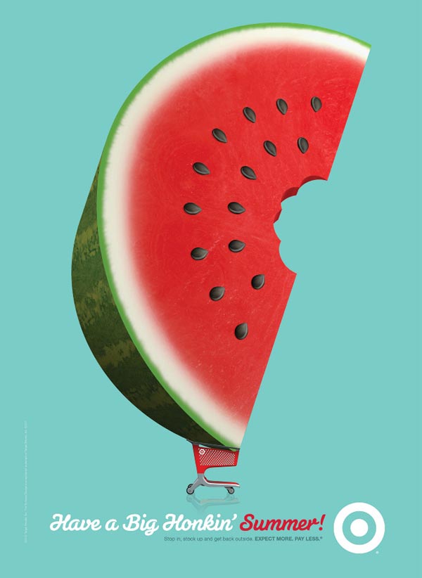
It's the time, of the season for watermelon
This is an ad for target, trying to get people thinking about summer. It shows a giant watermelon in a target shopping cart, basically says "come by your watermelon here, its the best." It also gets you thinking about summer. Because watermelon is a snack enjoyable in the summer, people start thinking about going to the beach, picnics in the park, etc. It is intended to be used only in the summer time or a little before, and the perfect place this poster ad would be at the entrance of the targets. It should be in the entrance because as the shoppers are going in to shop they will connect with this ad and buy watermelon. After summer it becomes useless to put up, and campaigns like this should only be used once. Although it is reusable for next year. Once it is taken down then watermelon doesn't become as important as it seemed, Because it is a summer fruit.
The idea is to make Target the key place to buy groceries, and specifically for the summer. The reason that this ad was made could be that people forget that Target also has a produce section, if not all then most of them. The marketing team might have seen some low numbers in produce and food spoils which means they are losing money. This ad campaign is reminding all the shoppers that there is a produce section and they should buy watermelon for summer snacks.It is a good idea, because most people forget about the produce isle at Target, and making it show that you can get a bigger watermelon there gets the shopper intrigued. Once they buy it and like it then they will always buy their watermelon and/or produce there. A way that this can be improved is designing various ads that depict either summer products or summer produce. This would equally said about the other seasons.
Friday, November 28, 2014
10 to 100th power
This is the famous Google logo. It is used as the "face" of Google, because once someone sees this logo they know right away what it stands for, what it does, and how it functions. It is intended for everyone who uses the internet, specifically high school to college students use Google. Even if they are not students the demographics are from that age group. Everyone seems to use Google at some point, it has become the default page for most peoples web browsers, it even has it's own emailing service. It is intended to be used online, that means where ever you have internet access whether at home, on the train, or at school Google can be accessed. The colors chosen were to give it a variety, to show that you can find many different things on this search engine. Since the beginning of it's launch Google logo has remained with the same 4 colors and same font, but those 4 colors and font stand for something much more than when the website first started up; It is the maps, google chrome, gmail, google earth, etc. During every holiday, special event, or the birthday of someone who had an impact in life through literature, civil rights, art, or science the Google logo will change to a sometimes interactive design or just a graphic design that represents that special day. In doing so it hasn't changed it's original purpose or mean, however it has changed the way people perceive Google as the kingpin of the internet.
The idea is that this logo shows, with its colors that it has variety within its search engine. As well as the actual word google in it's original mathematical meaning was 10 to the 100 power, which is 1 with 100 zeroes after it. Meaning there are a lot of searches a person can do. The design problem might have been that they didn't know exactly what it would end up looking like. It is a very good idea, usually the most simplest of ideas end up becoming the most impacting.
Robocop, Larger than Life
This is a movie poster for the remake of Robocop. It is used to get people informed about the movie coming out in theaters, while simultaneously have an aesthetically pleasing design. It is intended for people who watched the original Robocop in 1987 because it is like a reminder of what it was like. And it is also for new audiences that didn't get to experience the original one, because it looks like a good action movie. These posters should be used at all movie theaters, because they are reminders or previews of what movies will be out in the near future. They can also be used as billboard ads that are ten times bigger. The materials were chosen because that is what posters are generally made of. Since its production, it has changed in the way that people stop and look at the poster then make their decision about watching it. Once this movie is no longer playing in the theaters they remove the posters and they are hung in peoples houses or other private places.
The idea is to put you in the eyes of Robocop, you see what he sees because of the red line that goes through his helmet. There are also objectives written onto the poster which is supposed to get you to wonder what the 4th one is. That mystery leads to people wanting to know what will happen in the movie. It could be that the people in charge of promoting this film didn't have a specific promotion to watch the film in IMAX, therefore this is what they came up with. This makes Robocop look big, almost god like because the viewers are looking up at him. The promotional thought is that "This is just a preview of how Robocop will look in IMAX." The person that will be watching this would literally have to look up. This idea works, because it get the message across as being larger than life if experienced through IMAX. Something that would make it better is making giant prints of this movie instead of smaller regular sized posters. If this was on a billboard close to a theater that had IMAX, this poster would get the message across even clearer.
Sunday, November 23, 2014
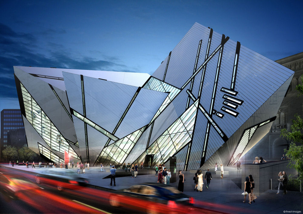
Dynamic Shift
This is an extension to the Royal Ontario Museum in Toronto, Canada
called the Michael Lee-Chin Crystal. It is a building that invites
people in with it's dynamic shape. This building works best in any major
city environment, in the downtown area. This is because the majority of
people would visit the downtown area of a city, it's more populated.
The materials chosen were used to maintain the building in such an odd
geometric shape. There must be light weight material used in order for
this building to stay in this shape. The way it has evolved from being
created is that people see this unique building and wonder what it,
which will let them explore their curiosity. They will end up visiting
the museum just to go into the building. This has not changed the
original meaning and purpose of building this museum, Daniel Libeskind
is known for making distinct building with such flare, which is what the
Royal Ontario Museum was expecting. There fore the flare that they
received was for the purpose of bringing more visitors.
The idea was to make a building that can be stand out and bring in a crowd of new visitors. It could be that the museum was in need of expansion and wanted to have a more modern looking building. Something that would wow people if they were to walk by it outside. It would make those people want to come in and see what the building looked like from inside. It is a very good idea, because this would get lots of people to come visit this building. It could have been expanded further to make it taller which would have been able to be seen from far away. Another thing they can do that can catch the attention of people, is if it was illuminated so that it can be seen at night.
Friday, November 21, 2014
The 15 flavors of social networking
This is an advertisement that promotes social networking and blogging. It's used to get people to explore the variety of different social networks. It is intended for people who use social network, the demographics are usually 15-35 years old. This is because lots of younger people use these specific social networking websites. It is intended to be used in advertising, whether on the internet or in a magazine. The subjects that were used are a waffle cone, with a pink swirl cover to give it the illusion of ice cream. The social networking logos are supposed to be the ice cream, and ice cream is sweet and desirable; its a nice treat. Therefore social networking in general is a desired treat. The text reads "What's your flavor?" Because everyone has a specific preference especially when it comes to ice cream. There has not been a change since its production, there fore the original meaning has remained the same.
The idea is to promote these social networks, what may have prompted this was that there were not a lot of those websites that weren't advertised as much or had sufficient enough money to do so. There are well known websites along side other lesser known websites, which would help their exposure. The idea is just okay there isn't really much to go from there. If they were to put more information about the different websites that would help them promote a lot more. This advertisement would work best online, and also if it had something that incorporated ice cream. For example if it was something like "What's your flavor? Click to sign up for one of these social networking sites and receive free ice cream." That would give them an incentive to click the link and promote all of the websites as well as incorporating the ice cream theme.
Friday, November 14, 2014
Beauty Within
This is a billboard for the hair dye Koleston. This billboard is used to promote Koleston, however it is done in a unique way by making it a cut out. The woman is a cut out and behind the billboard is a beach, and at different points of the day the cut out appears to change colors. Koleston's billboard is primarily targeted to women, because This is where the billboard should maintain it's position, because the change in colors throughout the day and night are what work for this billboard. The materials were chosen so that this billboard may remain standing and wouldn't be blown over. From installation it has not changed much, it has still remained the same, however when you look through the cut out the time of day makes the billboard change colors. During the day it does not seem to have a drastic change like sunset and night do, however the message of the billboard is still seen and remains effective.
The idea was to show changes of color in the woman's hair to advertise Koleston's hair dye. This was effectively accomplished by the change in day; at night the hair color looks black, in the sunset hours it appears golden and/or reddish. The design problem might have been that there was no effective way to show change in color through billboards. It is also very creative and unique which would get more attention from people. One way that they can improve on this is to make it bigger and be seen by more people. In this picture it looks a bit isolated, it maybe a private beach that not many people go to. If this billboard was to be on the pier or by the pier of a more commercial beach, it would be much more effective. Or just having multiple billboards in other beaches, whether they are more commercial or not. Because when there are more people will talk about them and will look almost like campaign.
Thursday, November 13, 2014
Sheirlf, the Shelf Chair
This is a couch that can also double as a bookshelf. Its used to sit down and relax and to store books, allowing for more space because it gets rid of the bookshelf. It is intended for readers of all ages, maybe the target audience would be teens to adults. This is because the couch looks more luxurious, and gives a sense of classiness as well as intelligence. A professor would probably own this couch, because it's sophistication may fit with the art decor of their living room or study. The materials were chosen to make it look sophisticated and to store the books within the couch. Since production it may haven only changed in that people didn't use it to it's max capacity. It has changed the original purpose if people are buying it and not really storing books in it. It could be because many people don't have enough books. Another thing that maybe was the purpose of this chair, was to get the people to read more. However it could be that they don't have enough time to read due to other obligations, which would change the original meaning of this chair.
The idea is to store books underneath a couch/chair to make more space in a room. It may have been a crowded room that lead to the creation of this couch; or it could be that there was no room for storing books anymore which lead to a combination of both. A combination of a couch and a bookshelf is a good idea for people who own lots of books. It's a place to both read and store books. The only thing that should be made better is the reinforcement of the book to sustain the person sitting down. At first glance at the picture it may seem like there is a thing layer between the cushion and the books. If a person were to sit there that maybe over the weight limit, that layer would give out and the person would just have a bookshelf shaped like a chair. A solution would be to make that particular layer out of a different material that can sustain more weight. Or to make that layer much more thicker so that it can be able to handle more weight.
Friday, November 7, 2014
I'm in distress, they've made a mess
This is called a gyro bowl, it's a bowl for toddlers that guarantees they will not spill anything. The function is simple the blue part is the handle and there are two bowls with in the middle. You put food in middle bowl, and there is another bowl like container that moves with the blue handle; which causes the middle bowl to move in an opposite direction. Because the bowl moves in the opposite direction this causes it to cover to prevent spillage. This product is marketed to mothers and fathers to make their life easier by preventing messes made by their child. However this is specifically for toddlers, because they tend to make a mess when they eat. Children are curious when young, they play with everything even their food, this is a toy and a bowl. It is intended to be used at home, in the car, basically anywhere you take your children. It's small enough to be portable, however because it is an awkward shape it may take up some space. The materials that were chosen were to keep it from breaking due to being played with. It has not changed from production, the concept and the way it is designed has remained the same.
The idea for this bowl is to prevent snacks from falling out, creating a mess. What could have brought this invention into development is someone who just got tired of cleaning messes and tried to find an easy way to prevent it. It is a good idea, however it does not work to its full potential. If this bowl were to be thrown and/or dropped it will make a mess. If you turn the blue handle slowly or at a medium pace it won't drop anything, but if you move it around in a faster motion you will have spills. They can design it for this bowl to be able to handle faster motions, that way they can stand behind their claim that this bowl does not spill. It can be done by changing the material that it is made from. Something that will be able to make the top bowl cover the bottom one faster, preventing all spills.
Thursday, November 6, 2014
Travel Express
This is a travel bag with a reinforcement plastic around the front of it to protect the valuables inside of it. It is a rolling bag that uses wheels that rotate 360 degrees, therefore whichever direction you walk, you won't have to turn the bag. This bag is for travelers that must take a lot of luggage with them wherever they go. It is intended to be used on the street or the sidewalk; it works best with concrete or a flat surface. The materials that were chosen were chosen for the purpose of making a good quality travel bag. One that can easily be taken anywhere and have reinforcement to protect valuables. From the production of this travel bag, the designer may have had one specific target audience which are people who go on vacation, business trips, etc. People can use this bag for anything. They can carry supplies, store important items, or transport fragile items. It does change the meaning because they are travel bags used for the purpose of travel. However, travel may not always mean flying.
The idea is to make a better design for the perfect travel suitcase. The problems that may have came from this were that some suitcases may have broken or gotten the luggage inside wet. Other problems that might have happened in the past are that this specific bag has 360 degree rotation for the wheels. On other bags the wheels where static and only moved in one direction making it a problem once you turn. The wheels would come across a crack on the floor and may tip the bag over because its balance is disrupted. The idea of fixing these problems are great however when it comes to the amount you must pay for these bags, that's where this great idea falls short. These design problems can be fixed without making the cost of the bag expensive. It can also be made from light weight material that way it won't affect the weight of the luggage, if it were to be weighed when going on a plane.
Sunday, November 2, 2014
Correct Me If I'm Wrong...
This is a spell check that is on the Microsoft Word, which was one of the first programs to have this feature. Basically, it helps with correcting any misspelled words that are written on the program. It's supposed to make proof reading a much faster process. It is intended for anybody that needs to write on Word, specifically students. Students are always writing papers, therefore it would be something specifically for them. It is intended to be used in the actual program, however many writing programs or applications carry this component. As long as this component is programmed into that specific writing application/program then it will work. Ever since the beginning of it being made it has help people correctly spell words, however it has also made people lazy at correcting and too dependent on spell check. The original purpose of this was to make people better spellers and make proof reading a little faster and easier. However, because it does all the work for the individual, they don't necessarily learn from their mistake.
The idea was to make correcting spelling and proof reading faster and less of a hassle. Most likely before spell check, it was very time consuming to go through multiple pages to correct the spelling, especially if it was more than twenty pages. The developers wanted to make this tedious task a thing of the past. Upon first development of spell check it was a brilliant idea, because it worked as it was supposed to. But after being exposed to for over 20 years people just seem to be dependent on it. Now a days this feature is found in phones that auto corrects for you. People don't even need to press the correct button anymore. This can still exist but in a manner that involves the user to learn from their mistake, not solve their problem. By having the user actually learn and correcting mistakes will prevent them from using spell check.
Following Light
This is the Simpson Tower building overlooking the 10 freeway at Cal State L.A. You know that it's the school because of the giant letters that say Cal State L.A. In the day time one can see them as simple white letters with a yellow/gold outline. At night the white part are lit up very brightly, that it illuminates on to the freeway. It's function is to make people aware that this school exists. Everyone who drives on the 10 freeway either west in the direction of Down Town L.A. or east in the direction of San Bernardino will see this sign and be able to read it. Everyone will know that there is a school that is in this area. This is a way that the school can get more people to attended here. While everyone passes by they will keep getting reminded of Cal State L.A., especially if they commuters. Once they get Cal State L.A. in their minds they will mention it to their friends, family, co-workers. And from there the word will spread, and bring in perspective students. This sign is intended to be used exactly where it is, it's right in front of the freeway where hundreds of thousands of people pass by everyday. The materials chosen where some sort of LED system where the brightness can extend onto the freeway. Since it has first been installed the letters have remained the same and illuminated. Although, lights do tend to go out either through power failure or because the lights burn out. Once this happens it will change the original purpose of the sign. It will still be able to be seen in the daytime however at night if there is at least one letter that is turned off, it will not be effective. It will look tacky and cheap, whenever someone drives by a store with a lit up sign and one of the letters is burned out it is seen as a joke. Since this is a marketing technique for the school, they do not want to look like a joke; or that they have cheaply made signs. This can be improved or prevented if they monitor the power monthly. Usually some sort of power gauge would be connected to this sign to view the power levels. Also knowing how long those specific bulbs or lights last is one way to prevent that.
The idea is to put Cal State L.A. on the map, meaning making everyone aware that this school exists. There was a sign there before it was illuminated, however it did not light up at night. There were however spot lights that would cast light on the letters. This method was not as successful as the current installation. The current sign that they have installed is a much better idea then the previous one. The sign stands out from the black background. It does what they intended on doing with the sign, people can read it from the freeway and it gets their attention. If this sign was duplicated on the other side of the building to display on the north side of the 10 freeway, people would see it as a landmark. Therefore spark more interest about applying to the university.
Friday, October 24, 2014
You'll love the way you look
This is a two-piece suit the blue jacket and the blue pants. This suit's main function is to look elegant, and/or professional. This suit is intended for anyone who can afford this $2000 dollar suit. It is for the people who enjoy style when they are either in the office or at a social gathering. This is a designer suit that can be used for any occasion. It's a suit, so it is intended to go where ever the person wearing it goes. The materials chosen when designing this suit were primarily for comfort. Its made of wool so that would make it warmer, or to be warn in colder weather. The suit itself has not changed from when first manufactured. It has remained the same, therefore the meaning of this suit has remained the same. The creator, Albert Hammond Jr. shares his original purpose of this suit in an interview:
'I want to make suits that I’m going to have for myself,” Hammond told New York Magazine. “They’re for the person who needs his one suit for a wedding. He’d rather get something like this than go to Men’s Wearhouse, pay the same amount, and look like an out-of-date parent.' In this aspect the suit visually stays the same, therefore his original vision and purpose will still fit the buyer; they won't look like the out-of-date parents he proclaims.
The idea is to make the person wearing it more fashionable. Albert Hammond Jr, had noticed that too many suits make people look like they are older and don't have a flair to them. It is a good idea for the purpose of what Albert is trying to accomplish. If he can help someone look better than someone that would buy a regular suit from somewhere else, then it is a good idea. The only problem is that this suit is way too expensive. It's probably double what a regular three-piece suit would cost at a regular suit shop. If he were to lower the price or sacrifice some things that make the suit expensive more people would be able to afford it, and by it being affordable more people would be able to buy it. Also another thing that doesn't work for this suit is that is way too exclusive. It is only offered at a boutique store. If it was offered at multiple places, this suit would be easily accessible to most people.
Thursday, October 23, 2014
iPost
This is a white apple, that has a bite taken out of it. It is the newest logo for Apple that goes behind the Mac Book Pro laptops. It is used as an identity marker, anywhere you look and see this logo it will indicate Apple. On a Mac Book Pro the apple is illuminated once it is on. This is attention grabbing it tells everyone who walks by that this is our product. Because it is a successful company this logo has become renowned. This logo is specifically targets students and people in professional fields of visual design (film, graphic design, photography) and music. It doesn't mean that they are the only target audience, it is just that their computers service to those specific fields. Apple's target is everyone that needs a computer. They have desktops that are usually not portable and can be used at a school, office, or at home. They also have iPods, iPhone, and Mac Book Pros that are portable and can be taken anywhere. Apple seems to use the same material for all their products they use plastic, glass, and carbon fiber. This is to make it close to quality product, however these devices seem to break fairly easy. Since this logo first came out it has gone through multiple changes, it used to be more colorful. When it was colorful it didn't seem to work, because of the multiple colors. It had to be a simple color so that it wouldn't be too distracting. Although the color changed the same logo stayed the same, with the bite mark and basic shape. The bite mark helps it's marketing by indicating that the product with this logo is desirable. Or it could say that one bite is all it takes to get you hooked.
The idea is to represent the company name which is apple. The point of using an achromatic logo is to make it simple. And the use of whites, blacks, and greys are futuristic and modern. For example, many of the expensive modern homes being build are grey and white or black and like they are made of stainless steel. The Apple logo very closely resembles those modern homes. It is a good idea, however Apple had already made a name for themselves before they switched to this achromatic logo. If they first started off with this logo it wouldn't have caught on and people back in the late 70's would think it was boring. In today's time it works because it's about the simplicity and elegance that this logo displays. This logo can be improved by bringing it to the third dimension. It's always been a "profile" view, it would be much more interesting to see the actual bite mark and if it was a three-quarter view of the apple. It would give it a much more unique take on the old simple logo. There can also be a design inside of the apple. Something that would give it a textured look or something that makes it look more futuristic. Since Apple's idea for the products represent futuristic representation.
Saturday, October 18, 2014
The Permanent Solution
This device here is a pen. The pen was created for the purpose of writing anything down on piece of paper. The pen is intended for everyone, regardless if you have hands or not. People can still hold the pen with their mouth or their feet. It doesn't matter if the person is illiterate or not, this device is a tool for knowledge; people learn things by writing them down. It can also be used to write down anything important that you wouldn't want to forget. But it also can be used in an artistic way by drawing on a piece of paper or writing down stories and poems. Its intended to be used wherever there is paper, and in the light otherwise you won't be able to see what you are writing. The materials of pens varies on how expensive they are. Some have been made out of metal, plastic, or wood and others have been made out of recycled paper. These materials were chosen so that the pen can be durable when writing, otherwise it could bend if gripped too tight.Within this harder shell is also the tube of ink which is attached to the ball point, which writes with accuracy.
From the beginning of its invention, people used feathers which they would dip in ink. As time went on they were made of different materials. The actual production of pens have changed from what they once were, because of new technologies. The original point of pens was to write ideas, drawings, and other things on paper. However some people don't use pens on just paper, some people write on other things that could be considered vandalism. For example the majority of where pens are used are in school, and some students use pen to draw on desks. This could make pens as tool of vandalism in a school setting.
The idea of making pens are to record ideas/art on to a piece of paper. What might have brought on the invention of pens was that no one had the ability to write down anything in a permanent way. Once the discovery of ink came along prompted the invention of the pen. It is a great idea to use ink as a form to write anything in a permanent way. But even though it being permanent is it's greatest quality, it could also be equally it's greatest flaw. Once you write in ink it is permanent and if anyone makes a mistake, they have to either cross it off or start over. This could lead it be very messy process if it's for something professional. A way that they can help this problem is to come up with a solvent eraser that can be put on the opposite side of the ball point edge. It would dissolve the ink form the actual paper, which won't make it messy.
From the beginning of its invention, people used feathers which they would dip in ink. As time went on they were made of different materials. The actual production of pens have changed from what they once were, because of new technologies. The original point of pens was to write ideas, drawings, and other things on paper. However some people don't use pens on just paper, some people write on other things that could be considered vandalism. For example the majority of where pens are used are in school, and some students use pen to draw on desks. This could make pens as tool of vandalism in a school setting.
The idea of making pens are to record ideas/art on to a piece of paper. What might have brought on the invention of pens was that no one had the ability to write down anything in a permanent way. Once the discovery of ink came along prompted the invention of the pen. It is a great idea to use ink as a form to write anything in a permanent way. But even though it being permanent is it's greatest quality, it could also be equally it's greatest flaw. Once you write in ink it is permanent and if anyone makes a mistake, they have to either cross it off or start over. This could lead it be very messy process if it's for something professional. A way that they can help this problem is to come up with a solvent eraser that can be put on the opposite side of the ball point edge. It would dissolve the ink form the actual paper, which won't make it messy.
Friday, October 17, 2014
Keep It Rolling
This is a roll of toilet paper that hangs off the wall of any restroom. It is used to wipe away any bodily waste, most commonly urine and/or fecal matter. The toilet paper is meant for everyone, everyone needs it because everyone must release bodily waste. It's a part of human nature, the same as breathing. Everything we eat, and everything that we drink must get filtered for its nutrients; and once we receive those nutrients the useless parts exit our body. The toilet paper is meant to be used in a private setting, any restroom anywhere that usually is more of a developed community will contain toilet paper. Every establishment has a restroom which must have toilet paper, whether it is for employees only or public, there is no building in a developed community that will not have a restroom. There for every establishment contains toilet paper. There are many places in the world that may not have this technology, there for making it less developed. They must find other means. But the toilet paper is universal, everyone or the majority have used and owns toilet paper. It is made of paper but is more tissue like and softer than usual paper. It's made softer so that it wont irritate or cause discomfort to the skin.
Toilet paper was invented to make wiping one self much more comfortable and convenient. More convenient because it's on a roll, and as you roll it you get a perfect length and use it. It has changed from original use, people have used toilet paper as a form of vandalism. A common form of vandalism is using various toilet paper rolls and throwing them over a tree or a house, causing an entanglement of paper; it could prove to be very difficult to clean up for the victim. The roll that it is wrapped in also has been used to make various things like kaleidoscopes, a maraca, or a pretend telescope. It does not change the original intention of the toilet paper, instead it gives it more use. The paper will go to waste however the roll it self will stay behind and be used to make whatever the imagination can.
The idea is to make a soft tissue to clean our bodily waste. The problem that probably brought on the invention of a soft tissue toilet paper is that in the past people might have had something more rough and uncomfortable. Someone came along and decided that there could be better paper. It is a very brilliant idea. The thought of having maybe leaves or some sort of rough paper as the only form to clean bodily waste seems like an under developed society. If man did not find ways to find this current form of toilet paper, how would this society expand to what it currently is now. Having a soft tissue as toilet paper speaks a lot of how the society is as in a developmental point of view. There are primitive societies of people the world that don't have the resources to make such things. Indigenous people who still live in jungles of South America for example need to find whatever they have at their disposal. Because they don't have that resource to make toilet paper, their society is under developed. And not because they don't have toilet paper, but because they can not make it. If a society can't make a soft tissue paper, then they don't have other resources to make any other technologies that a more developed society can easily make.
Saturday, October 11, 2014
Your Pick
These triangular pieces of plastic with rounded edges are guitar picks. It is used to make strumming the guitar a lot easier than your finger. The purpose of the pick is to be more precise on strumming the correct strings of a guitar. The guitar pick is intended for anyone who plays guitar, whether they are novice, proficient, or expert. You don't need a pick to play guitar but will allow you to play strings much faster and accurate. It can be used anywhere you have you're guitar. Whether it's at your house, at the beach, or at a bar picks are small and light which can be easily taken anywhere. Usually the materials used to make a pick are plastic. Depending on what type of picks you prefer there is more or less plastic in them. There are light, medium, and hard each designated for different purposes like faster strumming or harder strumming. It depends on the guitarist which they prefer, usually the medium are the most popular. A way that it has changed from production is that it has become a fashionable accessory. People have made them into necklaces, earrings, or with multiple picks made a bracelet. The picks are still useful in playing a guitar but what the creators would have never thought of them being made as a wearable accessory. And because of their variety of colors and small size people have used them to make mosaics. This does not change it's original purpose but gives it more of a purpose and value.
The original idea for these picks are meant to be small enough to fit in between each string and be able to play with accuracy and speed. The finger is too thick and may play the wrong string, or accidentally pluck another string. When playing with fingers the strumming sounds much more softer or muted, and with the pick it gives it a definable and loud sound. The pick is a good idea because it greatly improves overall sound of the guitar. Accuracy is key when playing guitar, if you play the wrong note it can effect the song drastically. The only problem with picks is that when you are playing the guitar it may slip out of you fingers. A way to solve this problem or to enhance it is to make the pick attach to your finger. An adhesive or a strap that may go around your finger can keep it from slipping off. Also making it a wearable device can be useful as well. The other problem that the pick has, is that it is easily lost. If there is some sort of light that can clip to the end or glow in the dark will be much easier to spot it out if you lose it at home. Also making some sort of tracking device that is installed into the pick itself can be a way of making sure you can never lose it. It would have to be registered through a "find it" app so that in any case you would be able to find it again.
Subway at the Bottom of the Globe
These are lights that are in most subway entrance in New York City. It's function is to clearly indicate that there is a subway stop, with out stating it in text. It is primarily for people who know there is a subway stop in the area, but to get a clear understanding of where it is. Now a days people use a map app on their phone that lets them know that the subway station is in the general vicinity, but the use of the globe lights are for these people to visually see where the entrance is.This is specifically for all the New York commuters that take the subway, but also for tourist; which New York has a lot of. In New York the subway station is the main form of public transportation. Everyone comes encounter with these globes of light. However the native New Yorkers will be used to these lights and the globes may not be useful to them, depending if they know the area or not. The tourist or someone that is non-local will benefit from it's full purpose.
These globes could be generally used anywhere there is a subway station, but it was adopted by New York. This can only be used at the entrances of the new york subway stations, otherwise it will lose it's purpose. For example, if it was used as regular street light or used inside the subway station it would me meaningless. It won't be used solely for the purpose of notifying people of the entrance. The shape and the use of these lights must be exclusive to the subway entrance.The reason the lights were chosen are because light attracts our vision. Sight is the best sense that would work to indicate an entrance. Ever since the creation of these globes they have been helpful until natives have gotten used to them. New York is one of the most touristic cities in the US, if the visitors catch on to this symbol of the subway then it will be very useful and stays to its original purpose.
The idea of these globes are to make it easier for commuters to spot the subway, and to give it almost a characteristic trait. A "face," something that someone would be able to associate with the subway station and be able to find it. It could be that people may have had a hard time finding the entrance that lead to the design and manufacturing of these lights. This is a good idea, because anyone who visits New York might have trouble finding the subway, especially at night the light stands out. But this only works if you have the sense of sight, if a person is blind this won't be a clear signal. This could be better improved if they use more than one sense. If it had a distinct sound or vibration as you near it, it may accurately get the attention of people that are blind or partially blind. Another thing that may be improved is that not all people will catch on that the globe is a symbol of the subway. It can be improved by making the lights much more illuminated or in one bright color. And instead of two on the actual stair way there could be additional ones around it, as well as one on the corners of the block where the subway station is located. Since not all the subway stations are on the corners, some people have to walk half way up the street until they find it. If there was multiple lights that were illuminating one color, and one on the corner of the streets people would have a better understanding of that.
These globes could be generally used anywhere there is a subway station, but it was adopted by New York. This can only be used at the entrances of the new york subway stations, otherwise it will lose it's purpose. For example, if it was used as regular street light or used inside the subway station it would me meaningless. It won't be used solely for the purpose of notifying people of the entrance. The shape and the use of these lights must be exclusive to the subway entrance.The reason the lights were chosen are because light attracts our vision. Sight is the best sense that would work to indicate an entrance. Ever since the creation of these globes they have been helpful until natives have gotten used to them. New York is one of the most touristic cities in the US, if the visitors catch on to this symbol of the subway then it will be very useful and stays to its original purpose.
The idea of these globes are to make it easier for commuters to spot the subway, and to give it almost a characteristic trait. A "face," something that someone would be able to associate with the subway station and be able to find it. It could be that people may have had a hard time finding the entrance that lead to the design and manufacturing of these lights. This is a good idea, because anyone who visits New York might have trouble finding the subway, especially at night the light stands out. But this only works if you have the sense of sight, if a person is blind this won't be a clear signal. This could be better improved if they use more than one sense. If it had a distinct sound or vibration as you near it, it may accurately get the attention of people that are blind or partially blind. Another thing that may be improved is that not all people will catch on that the globe is a symbol of the subway. It can be improved by making the lights much more illuminated or in one bright color. And instead of two on the actual stair way there could be additional ones around it, as well as one on the corners of the block where the subway station is located. Since not all the subway stations are on the corners, some people have to walk half way up the street until they find it. If there was multiple lights that were illuminating one color, and one on the corner of the streets people would have a better understanding of that.
Saturday, October 4, 2014
Informative Advertising
![]() |
This is a billboard that was once off the 10 freeway and the 605. It's used to inform the people who drive by that there are different ways to lower blood pressure. It's a big poster that gives people a sense of interest and hope. These billboards are intended to be anywhere there is always a large amount of people who can see it. Usually billboards are used to promote consumerism, usually some sort of product that is being sold or advertisement. However, this is much more different type of advertisement, it's more of a helpful and informative billboard. The colors are very calming but also meant to catch the attention. As well as the font, it's in a white color so that people drive by can easily read it. The woman is shown playing a ukulele and has smile across her face. Once this billboard was installed it was never meant to be permanent. After a few months it was replaced by a different billboard advertisement. This completely changed the informative message it was trying to give to everyone.
The idea was to promote healthy alternatives to lowering blood pressure, in this case the option was to learn to play a musical instrument. This idea is a win-win type of deal. The individual lowers their blood pressure and they learn to play an instrument, which can be a beautiful thing. People are not very well informed when it comes to health. Some may think that only drugs can be the only thing that can treat certain illnesses or conditions. This gives people a bit more insight on different things they may be able to do. The inclusion of the photograph helps for people to visualize happiness and see the calmness. It is an excellent idea that Kaiser came up not only to promote their hospital but health in general, because that is what their main goal is. A way that they may improve these is making a series of different facts that can alleviate any illnesses. If people are able to attain a healthy living outside of the hospital then this billboard accurately achieved it's goal.
Non-Traditional album release
This is the debut album Tyranny by Julian Casablancas + The Voidz, released on a usb/lighter sleeve. The consumer has the choice from one of the three colors black, yellow, and white. The full album in a high quality mp3 format is in this unique usb/lighter sleeve (lighter not included). This album is intended for smokers that have computers and prefer a digital format of an album. These consumers would also have to be fans of Julian Casablancas' work; his solo work or work with The Strokes. Usually the fans of The Strokes are around the age of early 20 - late 30, for the most part the majority are smokers. The usb is intended to be used where ever they have their computer and to drag all the music files on to their computer. From there sync the songs with their portable music device and have those songs where ever they go. As for the lighter sleeve that fits most lighters, the sleeve is intended to be fitted on to a lighter and go with the consumer where ever they may go. It may be at a bar, at school, or at a friends house. The materials chosen were a sort of stretchable plastic so that the sleeve may go over the lighter easily. It could have just become a collectable for those fans who do not smoke or use a computer. At most this usb holds 4 GB, people usually need more especially if they are college students. But otherwise the creators of this usb/lighter sleeve meant it to be used for multiple purposes, it's the consumer's so they can do what ever they want with it.
The concept of this item is to sell the album via a USB drive/lighter sleeve. This is something that's never been done before, selling an album on a usb along with lighter sleeve. The idea upon making this was to release something in a unique way. Since Julian Casablancas is the head of Cult Records, which is the record label that released his album Tyranny, he can find a unique way of marketing his album. This is a really great idea, because it's cheaper and you have a unique collectable item. Another instance of this is that the black lighter sleeve already sold out in Cult Record's merchandise page. It is a very effective way to sell the album, especially given screen time on TV. Julian Casablancas + The Voidz were on The Tonight Show with Jimmy Fallon, and he promoted the lighter before they took the stage. If the usb was able to hold more memory, then this product would more valuable. This way of marketing an album is very effective and is a way of connecting with the younger group of fans.
Subscribe to:
Posts (Atom)