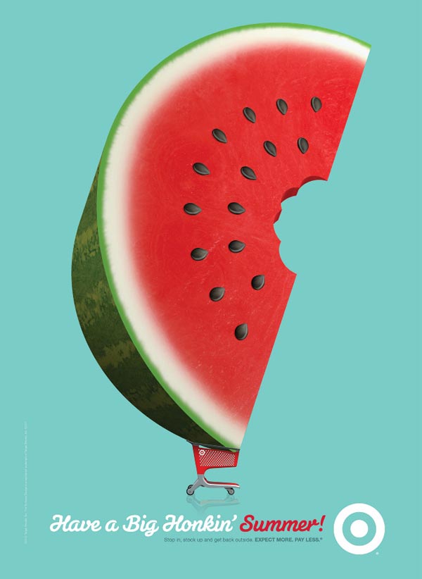
This is an ad for target, trying to get people thinking about summer. It shows a giant watermelon in a target shopping cart, basically says "come by your watermelon here, its the best." It also gets you thinking about summer. Because watermelon is a snack enjoyable in the summer, people start thinking about going to the beach, picnics in the park, etc. It is intended to be used only in the summer time or a little before, and the perfect place this poster ad would be at the entrance of the targets. It should be in the entrance because as the shoppers are going in to shop they will connect with this ad and buy watermelon. After summer it becomes useless to put up, and campaigns like this should only be used once. Although it is reusable for next year. Once it is taken down then watermelon doesn't become as important as it seemed, Because it is a summer fruit.
The idea is to make Target the key place to buy groceries, and specifically for the summer. The reason that this ad was made could be that people forget that Target also has a produce section, if not all then most of them. The marketing team might have seen some low numbers in produce and food spoils which means they are losing money. This ad campaign is reminding all the shoppers that there is a produce section and they should buy watermelon for summer snacks.It is a good idea, because most people forget about the produce isle at Target, and making it show that you can get a bigger watermelon there gets the shopper intrigued. Once they buy it and like it then they will always buy their watermelon and/or produce there. A way that this can be improved is designing various ads that depict either summer products or summer produce. This would equally said about the other seasons.