Wednesday, December 3, 2014

A Lending Hand

This is an advertisement for the World Wide Fund for Nature. It is used to spread the word of of their foundation, to bring awareness of conserving the natural life. This is intended for people that are eco-friendly and like to conserve nature, but don't really know how. Usually that age group of people ranges from 20 - 45. This is because the younger demographic is seen to participate in the conservation of nature. This is intended to used in any wildlife magazines, it may also be used in commercials on TV for animal planet. The hand was chosen to represent an elephant because of the texture of the skin, and because the finger represents the trunk of the elephant. Since production people stop and admire this design and every time they see this advertisement or an elephant, they will be reminded of WWF. It illustrates the exact meaning that the WWF is trying to portray, it doesn't change the meaning.

The idea of this advertisement is to give a lending hand to nature. The design flaw might have been that there was no specific way of representing the helping hand in a creative way. This was an excellent idea because it fully represents helping nature. It depicts an animal on the hand of the humans, the ones who can save the ecosystem. The only thing that could be done differently is changing the background color so that the elephant does not blend in to the background. That way it can stand out and contrast, making the elephant/hand much more predominant.

Monday, December 1, 2014

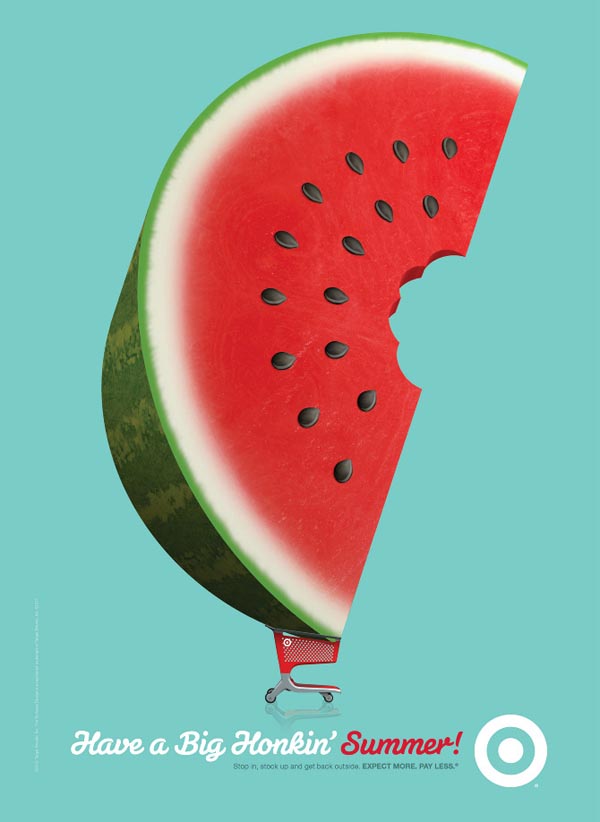
It's the time, of the season for watermelon

This is an ad for target, trying to get people thinking about summer. It shows a giant watermelon in a target shopping cart, basically says "come by your watermelon here, its the best." It also gets you thinking about summer. Because watermelon is a snack enjoyable in the summer, people start thinking about going to the beach, picnics in the park, etc.  It is intended to be used only in the summer time or a little before, and the perfect place this poster ad would be at the entrance of the targets. It should be in the entrance because as the shoppers are going in to shop they will connect with this ad and buy watermelon. After summer it becomes useless to put up, and campaigns like this should only be used once. Although it is reusable for next year. Once it is taken down then watermelon doesn't become as important as it seemed, Because it is a summer fruit.

The idea is to make Target the key place to buy groceries, and specifically for the summer. The reason that this ad was made could be that people forget that Target also has a produce section, if not all then most of them. The marketing team might have seen some low numbers in produce and food spoils which means they are losing money. This ad campaign is reminding all the shoppers that there is a produce section and they should buy watermelon for summer snacks.It is a good idea, because most people forget about the produce isle at Target, and making it show that you can get a bigger watermelon there gets the shopper intrigued. Once they buy it and like it then they will always buy their watermelon and/or produce there. A way that this can be improved is designing various ads that depict either summer products or summer produce. This would equally said about the other seasons.

Friday, November 28, 2014

10 to 100th power

This is the famous Google logo. It is used as the "face" of Google, because once someone sees this logo they know right away what it stands for, what it does, and how it functions. It is intended for everyone who uses the internet, specifically high school to college students use Google. Even if they are not students the demographics are from that age group. Everyone seems to use Google at some point, it has become the default page for most peoples web browsers, it even has it's own emailing service. It is intended to be used online, that means where ever you have internet access whether at home, on the train, or at school Google can be accessed. The colors chosen were to give it a variety, to show that you can find many different things on this search engine. Since the beginning of it's launch Google logo has remained with the same 4 colors and same font, but those 4 colors and font stand for something much more than when the website first started up; It is the maps, google chrome, gmail, google earth, etc. During every holiday, special event, or the birthday of someone who had an impact in life through literature, civil rights, art, or science the Google logo will change to a sometimes interactive design or just a graphic design that represents that special day. In doing so it hasn't changed it's original purpose or mean, however it has changed the way people perceive Google as the kingpin of the internet.

The idea is that this logo shows, with its colors that it has variety within its search engine. As well as the actual word google in it's original mathematical meaning was 10 to the 100 power, which is 1 with 100 zeroes after it. Meaning there are a lot of searches a person can do. The design problem might have been that they didn't know exactly what it would end up looking like. It is a very good idea, usually the most simplest of ideas end up becoming the most impacting.

Robocop, Larger than Life

This is a movie poster for the remake of Robocop. It is used to get people informed about the movie coming out in theaters, while simultaneously have an aesthetically pleasing design. It is intended for people who watched the original Robocop in 1987 because it is like a reminder of what it was like. And it is also for new audiences that didn't get to experience the original one, because it looks like a good action movie. These posters should be used at all movie theaters, because they are reminders or previews of what movies will be out in the near future. They can also be used as billboard ads that are ten times bigger. The materials were chosen because that is what posters are generally made of. Since its production, it has changed in the way that people stop and look at the poster then make their decision about watching it. Once this movie is no longer playing in the theaters they remove the posters and they are hung in peoples houses or other private places.

The idea is to put you in the eyes of Robocop, you see what he sees because of the red line that goes through his helmet. There are also objectives written onto the poster which is supposed to get you to wonder what the 4th one is. That mystery leads to people wanting to know what will happen in the movie. It could be that the people in charge of promoting this film didn't have a specific promotion to watch the film in IMAX, therefore this is what they came up with. This makes Robocop look big, almost god like because the viewers are looking up at him. The promotional thought is that "This is just a preview of how Robocop will look in IMAX."  The person that will be watching this would literally have to look up. This idea works, because it get the message across as being larger than life if experienced through IMAX. Something that would make it better is making giant prints of this movie instead of smaller regular sized posters. If this was on a billboard close to a theater that had IMAX, this poster would get the message across even clearer.

Sunday, November 23, 2014

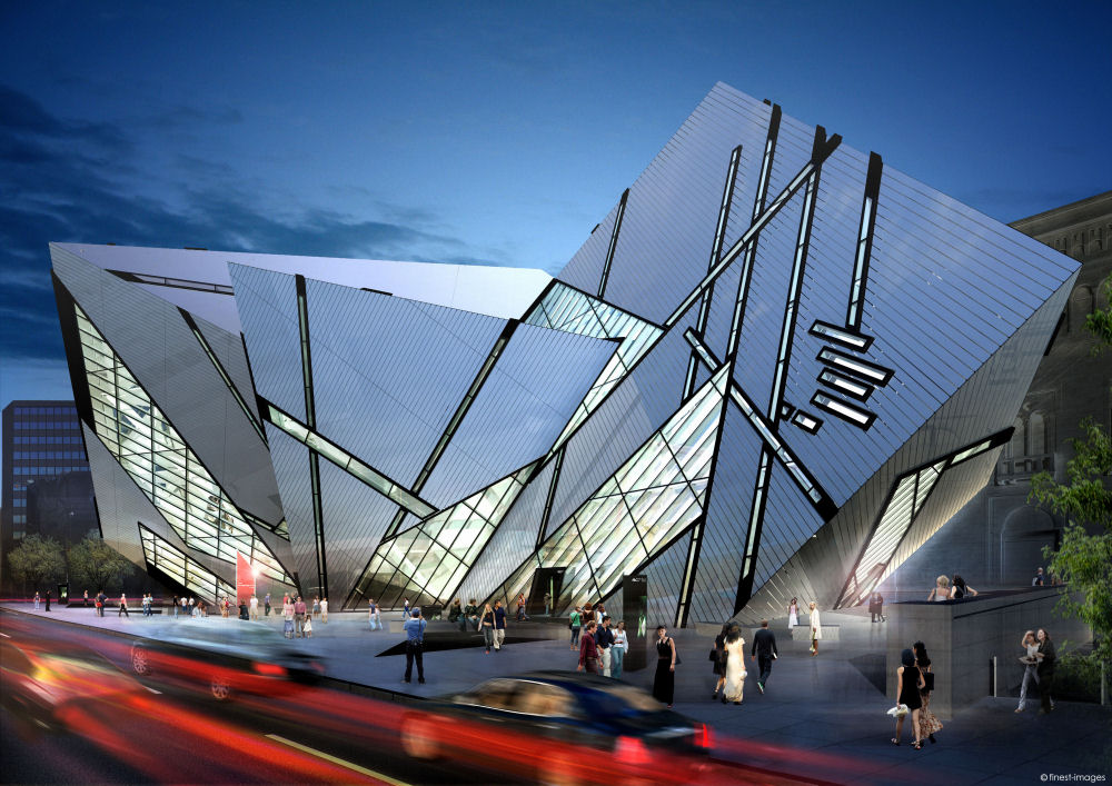
Dynamic Shift

This is an extension to the Royal Ontario Museum in Toronto, Canada called the Michael Lee-Chin Crystal. It is a building that invites people in with it's dynamic shape. This building works best in any major city environment, in the downtown area. This is because the majority of people would visit the downtown area of  a city, it's more populated. The materials chosen were used to maintain the building in such an odd geometric shape. There must be light weight material used in order for this building to stay in this shape. The way it has evolved from being created is that people see this unique building and wonder what it, which will let them explore their curiosity. They will end up visiting the museum just to go into the building. This has not changed the original meaning and purpose of building this museum, Daniel Libeskind is known for making distinct building with such flare, which is what the Royal Ontario Museum was expecting. There fore the flare that they received was for the purpose of bringing more visitors.

The idea was to make a building that can be stand out and bring in a crowd of new visitors. It could be that the museum was in need of expansion and wanted to have a more modern looking building. Something that would wow people if they were to walk by it outside. It would make those people want to come in and see what the building looked like from inside. It is a very good idea, because this would get lots of people to come visit this building. It could have been expanded further to make it taller which would have been able to be seen from far away. Another thing they can do that can catch the attention of people, is if it was illuminated so that it can be seen at night.

Friday, November 21, 2014

The 15 flavors of social networking

This is an advertisement that promotes social networking and blogging. It's used to get people to explore the variety of different social networks. It is intended for people who use social network, the demographics are usually 15-35 years old. This is because lots of younger people use these specific social networking websites. It is intended to be used in advertising, whether on the internet or in a magazine. The subjects that were used are a waffle cone, with a pink swirl cover to give it the illusion of ice cream. The social networking logos are supposed to be the ice cream, and ice cream is sweet and desirable; its a nice treat. Therefore social networking in general is a desired treat. The text reads "What's your flavor?" Because everyone has a specific preference especially when it comes to ice cream. There has not been a change since its production, there fore the original meaning has remained the same.

The idea is to promote these social networks, what may have prompted this was that there were not a lot of those websites that weren't advertised as much or had sufficient enough money to do so. There are well known websites along side other lesser known websites, which would help their exposure. The idea is just okay there isn't really much to go from there. If they were to put more information about the different websites that would help them promote a lot more. This advertisement would work best online, and also if it had something that incorporated ice cream. For example if it was something like "What's your flavor? Click to sign up for one of these social networking sites and receive free ice cream." That would give them an incentive to click the link and promote all of the websites as well as incorporating the ice cream theme.

Friday, November 14, 2014

Beauty Within

This is a billboard for the hair dye Koleston. This billboard is used to promote Koleston, however it is done in a unique way by making it a cut out. The woman is a cut out and behind the billboard is a beach, and at different points of the day the cut out appears to change colors. Koleston's billboard is primarily targeted to women, because This is where the billboard should maintain it's position, because the change in colors throughout the day and night are what work for this billboard. The materials were chosen so that this billboard may remain standing and wouldn't be blown over. From installation it has not changed much, it has still remained the same, however when you look through the cut out the time of day makes the billboard change colors. During the day it does not seem to have a drastic change like sunset and night do, however the message of the billboard is still seen and remains effective.

The idea was to show changes of color in the woman's hair to advertise Koleston's hair dye. This was effectively accomplished by the change in day; at night the hair color looks black, in the sunset hours it appears golden and/or reddish. The design problem might have been that there was no effective way to show change in color through billboards. It is also very creative and unique which would get more attention from people. One way that they can improve on this is to make it bigger and be seen by more people. In this picture it looks a bit isolated, it maybe a private beach that not many people go to. If this billboard was to be on the pier or by the pier of a more commercial beach, it would be much more effective. Or just having multiple billboards in other beaches, whether they are more commercial or not. Because when there are more people will talk about them and will look almost like campaign.